
Monday, May 03, 2010
Herbal essences gift package

Self Promotion and candidates
Finally, its been a while but i can say i have my buisness cards now, im real pleased on how they've turned out, can't wait to start handing them out. My website is also almost finnished, just a few more bits to do and i can start uploading it to a host, so keep an eye out i will post a link here to it when it is done. I am also looking for candidates for websites to go onto my "random favorite" link, so if you've got a website that you think is worth promotiong on there drop your link in the comments bellow so i can check it out.


Thursday, April 22, 2010
I said i would post this.... my before college days.
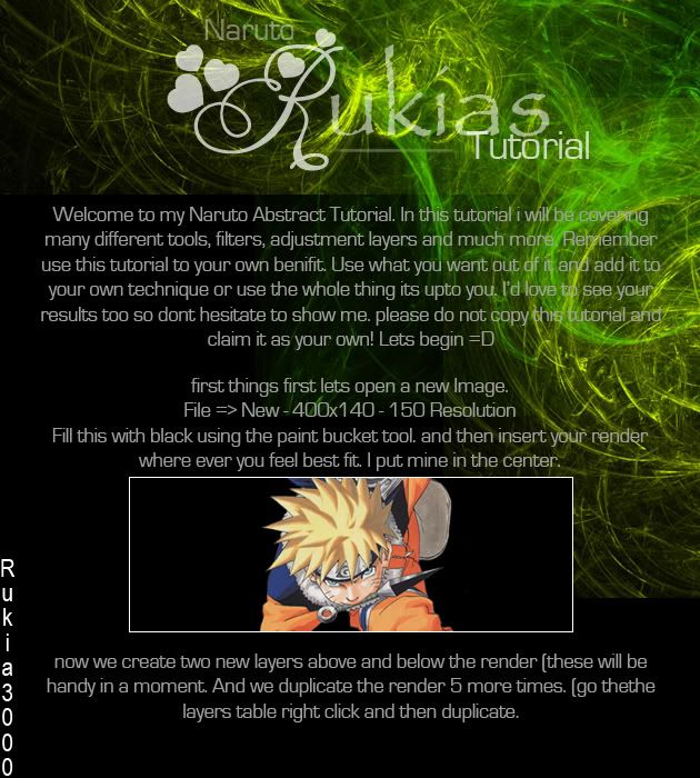
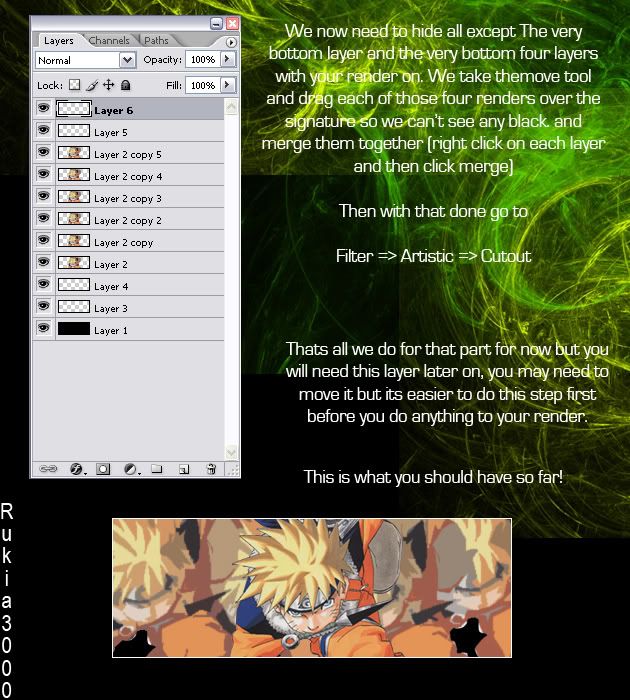
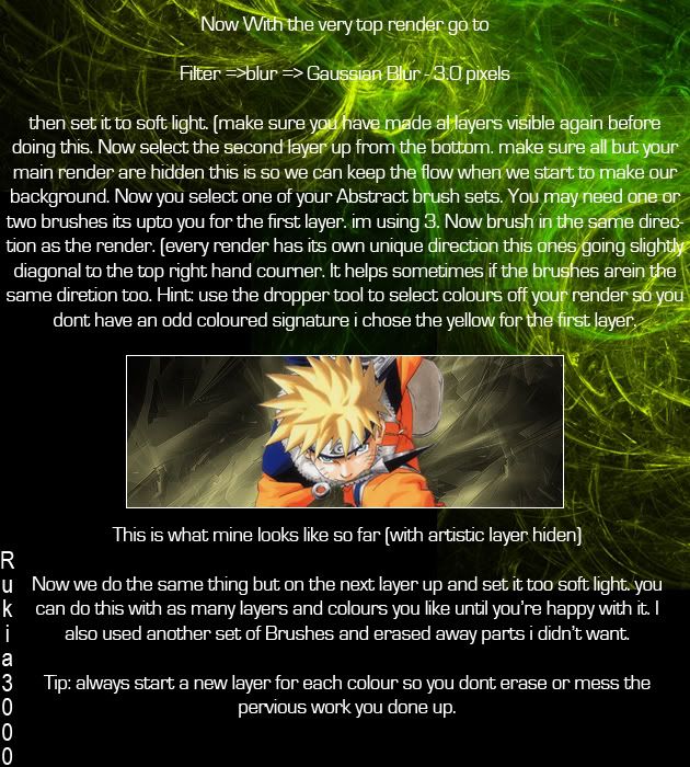
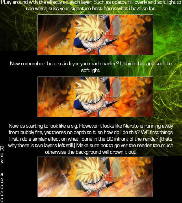
A while ago i said i would post a tutorial, well i made this ages ago, and for a little fun and a laugh thought id post it, jsut to break off from the serious stuff for a bit. I Made it when i was teaching photoshop to people about 5 years ago on some online forum, A lot of them found it real handy, mostly for techniques rather than for making banners as i have in this, so enjoy comment, i laugh everytime i see this now at how much i have improved, its nice to sometimes reflect on old work to help you realise how much you really have improved.


well i hope you enjoyed that, now its back to the serious design side of things in the next entry.
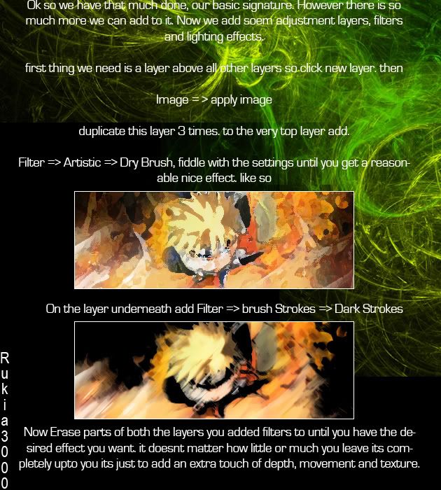
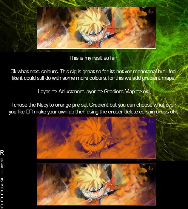
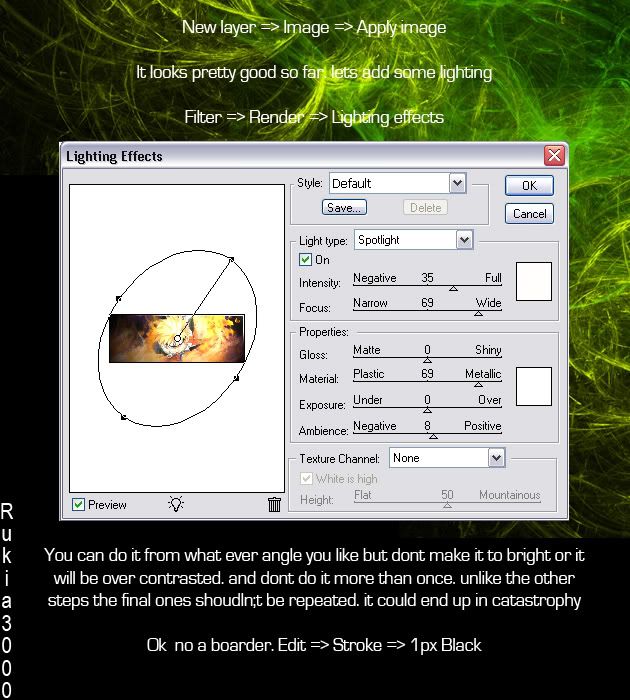

well i hope you enjoyed that, now its back to the serious design side of things in the next entry.
Photos, A first outing.
Finally the weather is nice enough to venture outside for photo taking, and im starting to get into the swing of it again, so i would like to share a few shots with you mostly macro photography however i really like these images.


This is only two of many photos i took howeve i havent managed to upload them all yet to post. My design work itself is comming on nicely and i hope to have my website up soon aswell, so keep an eye out for posts with more of my design work and the launch of my website.


This is only two of many photos i took howeve i havent managed to upload them all yet to post. My design work itself is comming on nicely and i hope to have my website up soon aswell, so keep an eye out for posts with more of my design work and the launch of my website.
Monday, April 19, 2010
Contemplating and Review
Its only 11 weeks til I finnish University, not long, that includes our final exhibition and i will give some more details on that a bit later on in another entry.
In previous blogs i mensioned about ordering a book, well i have read it and i loved it! theres so much treasure in the small book, its also got a few "tasks" in it aswell Its reat ofr anyone looking at branding or logo design, and its all wirtten by designers, not some critique who thinks they know everything and not even been there.

There was one thing mensioned in there i have tried out so far, and thats about logo awareness. I've done this twice in 3 different places to get an idea for my own advertising. All it is in the space of 30 seconds of what ever you're doing to just sitting in a place and looking around you count how many logos you see. the first time i counted 48 and that was sitting in my own room, the second was driving along in the car, I counted 23 and the 3rd time was during the ad break of Dr who and going to make myself a drink. Im going to keep refering to this book, its highly recomended by myself and a friend.

In previous blogs i mensioned about ordering a book, well i have read it and i loved it! theres so much treasure in the small book, its also got a few "tasks" in it aswell Its reat ofr anyone looking at branding or logo design, and its all wirtten by designers, not some critique who thinks they know everything and not even been there.

There was one thing mensioned in there i have tried out so far, and thats about logo awareness. I've done this twice in 3 different places to get an idea for my own advertising. All it is in the space of 30 seconds of what ever you're doing to just sitting in a place and looking around you count how many logos you see. the first time i counted 48 and that was sitting in my own room, the second was driving along in the car, I counted 23 and the 3rd time was during the ad break of Dr who and going to make myself a drink. Im going to keep refering to this book, its highly recomended by myself and a friend.

Thursday, March 18, 2010
Cherry crafts

I was having a look around on logo design loves facebook group and looking at all the work other designers have done and i found two that were worth blogging that i've seen recently and this is one. I thought it was brilliant work, the type face sits perfectly with an imaginative literal cherry cottage with a 3D feel to it, sometwhat almost like a Mac icon feel. Simple imaginative and creative this was designed by Ross Green, its definatly more than just a logo.
A book worth buying?
I've decided it was about time i stopped borrowing books and baught a few of my own design books. And i found one that seemed interesting i will give a reveiw afterwards of my own once i recieve it in a few days. It is called logo design love, they have a facebook group aswell. its as you can guess by the title all about logos and branding and i thought it would be one of he 2 best places to start alongside typography and fonts. I baught it from Amazon.co.uk for £12.99 it was the cheapest ive seen it everywhere else was £25 abouts. so if you want to check it out for yourself it would be best to buy there. If you've read/looked at it and have any reveiws dont hesitate to leave them below. And if you have any typography/font book suggestions do the same.
Wednesday, March 17, 2010
Blender
Just a quick note to myself really, but if anyone else is interested, one of my followers showed me a programme as i was interested in doing some 3D logos and told me about blender so first thing i done, looking up tutorials if anyone knows of any good ones and this is the most basic starter i could find
blender tutorial
old photoshop banner tutorials with blending comming soon!
blender tutorial
old photoshop banner tutorials with blending comming soon!
Friday, March 12, 2010
Fonts away!
I've been trying to search for many a font and found so many sites that do free fonts, so i thought i would list them all here for everyone else and for later reference.
Fonts for big headers:
Fonts for minimal design:
High quality funky graphical fonts:
Bad me i guess?
Well i seem to have neglected my blog one night.. oops. well i was going to do a "blast from the past!" blog but im leaving that til tomorrow because i need to find the images to write it.
I still cant beleive how far my own design thinking has come aswel as my work, i cant help but feel proud. but thats not the only thng thats changed, design in general has changed over the years, and rather largely. you wouldnt think it but the same as fasion and technology design seems to go through "fads" aswell from vetor and clean design to the old war ime poster feel and back again, its like i said in my last blog technology is always changing, and so is design, its trying to keep up with that aswell as acheiving goals thats the hard part.
I'd like to slip in here the link to my deviantart page, i love design and so forth but at the same time i love photography, i guess it kind of comes with the design process in some casses especially for art directors. ive had a lot of inspiration from my own photos, and i love my macro shots so please feel free to look around on there too. here are just a few images including a photo of japanese singer momoi halko during her pannel at Ayacon 2009:
http://hatsune-hawke.deviantart.com


I still cant beleive how far my own design thinking has come aswel as my work, i cant help but feel proud. but thats not the only thng thats changed, design in general has changed over the years, and rather largely. you wouldnt think it but the same as fasion and technology design seems to go through "fads" aswell from vetor and clean design to the old war ime poster feel and back again, its like i said in my last blog technology is always changing, and so is design, its trying to keep up with that aswell as acheiving goals thats the hard part.
I'd like to slip in here the link to my deviantart page, i love design and so forth but at the same time i love photography, i guess it kind of comes with the design process in some casses especially for art directors. ive had a lot of inspiration from my own photos, and i love my macro shots so please feel free to look around on there too. here are just a few images including a photo of japanese singer momoi halko during her pannel at Ayacon 2009:
http://hatsune-hawke.deviantart.com


Tuesday, March 09, 2010
Keeping up with technology.
Although being very inspired to write about the lecture i attended today i am unable to get my notes to tell you enough so here i will talk about this instead.
Is it hard to keep up to date with technology? In my opinion with design its always hard theres always something new, new ways of advertising, new ways of promoting, new technology being introduced needing new designs and programming, new programmming to create designs, but thats the great thing. if you can keep up with it it can be very useful. I was searching for some flash websites for inspiration the other day and found this:
http://www.promote.uk.com/eTAG/
I thought it was brilliant! A new way of advertising, being advertised using new technology. I loved the animation too, modern sleek and quite cute too.
http://www.promote.uk.com/
also an amasing designed flash website.
Is it hard to keep up to date with technology? In my opinion with design its always hard theres always something new, new ways of advertising, new ways of promoting, new technology being introduced needing new designs and programming, new programmming to create designs, but thats the great thing. if you can keep up with it it can be very useful. I was searching for some flash websites for inspiration the other day and found this:
http://www.promote.uk.com/eTAG/
I thought it was brilliant! A new way of advertising, being advertised using new technology. I loved the animation too, modern sleek and quite cute too.
http://www.promote.uk.com/
also an amasing designed flash website.
Just a short post.
Just a short post today, i've not had time really to do too much been a very busy day and heres to more to come. I've got my flow back now i think, im feeling good about it all. so here is a link to something else (yeah i know another link) i will get around to finding some more interesting stuff later but as i said been very busy.
http://weburbanist.com/2008/06/29/top-10-3d-graffiti-artists-in-the-world
i never get tired of these images.
http://weburbanist.com/2008/06/29/top-10-3d-graffiti-artists-in-the-world
i never get tired of these images.
Monday, March 08, 2010
Photoshop Manipulations and fun
Designs not always about hard work, infact i personally always look forward to designing soemthing new and exciting taking on the challenge. But i have had a few times got some ideas and not known how to put them together or how o get certain effects. But a while back i found this:
Manipulation
Its a site with some amasing photoshop tutorials on with links to many many others. I've even tried a few myself and i found them really useful, finding out how to use certain things and merge others how to get a certain effect on objects or creat something new, or old looking. somethings i knew before but its always good to brush up on these things. Well i dont a few and here were my results. I was uite chuffed with them, it was my first try at some of these things, including creating the new photoshop box logo,


Manipulation
Its a site with some amasing photoshop tutorials on with links to many many others. I've even tried a few myself and i found them really useful, finding out how to use certain things and merge others how to get a certain effect on objects or creat something new, or old looking. somethings i knew before but its always good to brush up on these things. Well i dont a few and here were my results. I was uite chuffed with them, it was my first try at some of these things, including creating the new photoshop box logo,


Saturday, March 06, 2010
Yipee!
I don't have really anything to put into my blog today, but ill make up with someothing tomorrow however i have to celebrate today as i managed to get hold of 2 free tickets for myself and my mother to go to Grand Designs being held at Londons Excel Centre 1-9th May. Although its not 100% to do with the sort of design i do, it is still inspiring, and you can get some good ideas from it. however the second i got my tickets i was screaming at the screen about how badly pixilated it was saying "you should have saved it as a TIFF first!". It's pretty exciting, i've been watching it on TV all these years, and now i finally get to go! however i have been asked ever so kindly by my mother now not to do what i do around the supermarket and to be on my best behaviour. "what do you do?" Well what any Graphic designer does points out packaging say how they would change it or say "i've done somethig connected to that" I must admit it is anoying but to know you have done something that tiny bit that is being used in everyones daily lives, you just get that tiny peice of satisfaction out of it, and it definatly does make my day and i hope it will in years to come.
Friday, March 05, 2010
Designer block
They always say sometimes theres days when things really dont come to you at all, and its best not to force crative thoughts toherwise they could result in something terrible. I've currently come to a halt in my currnt project because of it, and hopefully can get on track soon! bother other things are flowing fine, infact more than fine (see other blog for outside of design things).
There is one thing i've noticed used a lot lately though. After summer last year trying to take photos out the car at night of the lights i realised how awsome the images were that came out of it, blurry lines of glowing light making patterns, then on the news more and more adverts tarted to appear with the sae kind of effect. I really like how it works and its really effective, i hope i find a use for my own photos someday but for now heres an example

actually whilst searching for an xample i found a really favorite site of mine and its even given me some ideas for my project *thumbs up* I've been watching it for ages i cant beleive i forgot about it. This site i added afer i was looking for a creative desktop/log in screen for my computer. they have some brilliant photoshop tutorial and illistrator tutorials and the results are simply amasing, heres the link and some imagery its definatly worth a look in =D


There is one thing i've noticed used a lot lately though. After summer last year trying to take photos out the car at night of the lights i realised how awsome the images were that came out of it, blurry lines of glowing light making patterns, then on the news more and more adverts tarted to appear with the sae kind of effect. I really like how it works and its really effective, i hope i find a use for my own photos someday but for now heres an example

actually whilst searching for an xample i found a really favorite site of mine and its even given me some ideas for my project *thumbs up* I've been watching it for ages i cant beleive i forgot about it. This site i added afer i was looking for a creative desktop/log in screen for my computer. they have some brilliant photoshop tutorial and illistrator tutorials and the results are simply amasing, heres the link and some imagery its definatly worth a look in =D
The whole website is amasingly created and illistrated!
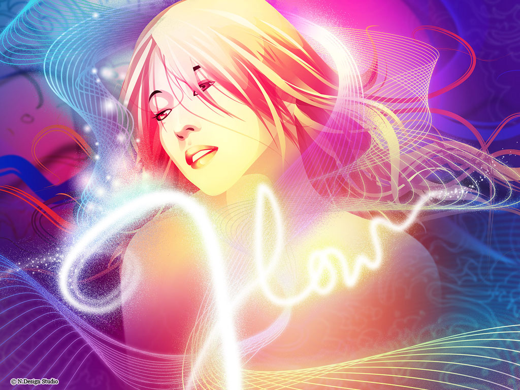


they even have a flash site veiwable here:
although its no longer updated, but it includes some of their earlier G.comm designs aswell as illistrations and web designs. i hope you like as much as i do.
Wednesday, March 03, 2010
“Hi & Lo” – Special Collboration Product
And here is the answerto my previous post! But we never know they may eventually ey? But this is a pretty awsome exhibition not just because of what takashi mirukami added to it. here the link
"Hi & Lo"
"Hi & Lo"
Takashi Murakami!
Although an artist Takashi murakami has had a lot of inspiration on me in the past so he deserves a slot in my blog! He is the most amasings japanese artist and i am ashamed to say i am really dissapointe i didnt go to see his first london exhibit in the tate gallery. however recently he along with Fragment and Kaikai Kiki brands have come up with some awsome stuff, now i do not know if it is for sale, i know he has books but i would LOVE the shoes and a couple of his cushions =D They are really something amasing simple and stylish. He was my inspirtion through my Art diploma in collage and he still inspires me to date!


A few of you may actually recognise some of his works from his recent appearance in Kursten's new music video for her cover of "turning japanese" although i am discusted by the video and he interpritations of cosplay (and the fact shes a big multi millionaire supposedly and couldnt even afford a decent wig!) and what its about and japanese culture Takashi Mirukami done a good job trying to get it better thatn what she wanted it to be like.
Bad design is bad!
Working on my current project i was searching up Merlin entertainments, fair enough they have some amasing stuff.... but ha anyone noticed one logo that stands out from the rest.. one website that you would think they would have put effort into due to its cause and not? yup the Sealife sanctuarys (not the centres). heres the link to their website and their logo:
~*Link*~

~*Link*~

It might be just me however this in my opinion is very poorly designed they could have had something that fitted in with their other parks and so on, but no they've made it more like a RSPCA logo on a £20 budget! Wtih a logo thats been edited to suit multiple places, i somewhat feel like this may have even been drawn in paint? but it definatly doesnt do justice for what the sealife sanctuary is really about. Opinons? leave them in the comment box below!
Tuesday, March 02, 2010
Demonia Branding.
A previous Branding Project tookk me to branding Demonia, A world wide shoe company for gothic, alternative and other footwear including Lolita, and club wear aswell as every day footwear. they have a website if you wish to see what they current branding is like, however when discussed this was found to put a lot of people off buyng their shoes, or stores having them on their shelves. As they were too over the top gothic and didnt really show ther true potential and poen them for all people to buy as the target audience. Here is the logo for the new brandim i have designed.


Monday, March 01, 2010
Norwich Housing Society
From a live brief competition to design a logo for Norwich housing society, including stationary, heres the logo on a bilboard comments welcome. I became one of the four finalists and I'm about to hand it the final edited design. It was inspired by the shape of the housing they provide. the colour was their colour they already used. The reason for text layout was to get away from their NHS connection, as they were nothing to do with the hospital at all.


Subscribe to:
Posts (Atom)
