They always say sometimes theres days when things really dont come to you at all, and its best not to force crative thoughts toherwise they could result in something terrible. I've currently come to a halt in my currnt project because of it, and hopefully can get on track soon! bother other things are flowing fine, infact more than fine (see other blog for outside of design things).
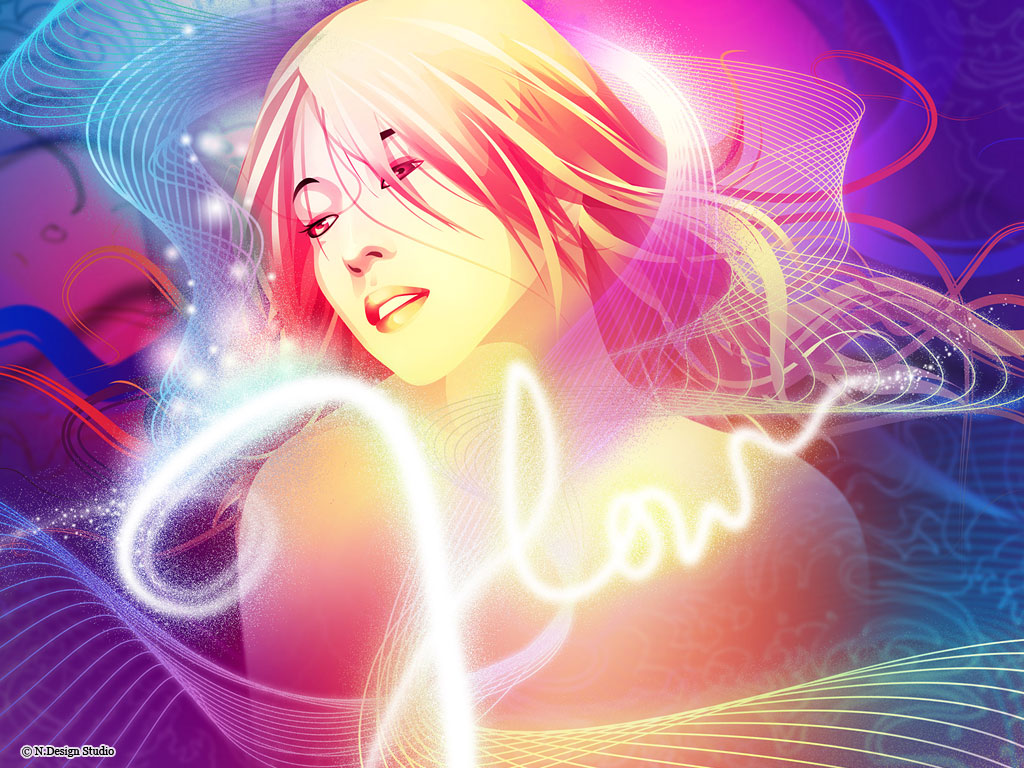
There is one thing i've noticed used a lot lately though. After summer last year trying to take photos out the car at night of the lights i realised how awsome the images were that came out of it, blurry lines of glowing light making patterns, then on the news more and more adverts tarted to appear with the sae kind of effect. I really like how it works and its really effective, i hope i find a use for my own photos someday but for now heres an example
actually whilst searching for an xample i found a really favorite site of mine and its even given me some ideas for my project *thumbs up* I've been watching it for ages i cant beleive i forgot about it. This site i added afer i was looking for a creative desktop/log in screen for my computer. they have some brilliant photoshop tutorial and illistrator tutorials and the results are simply amasing, heres the link and some imagery its definatly worth a look in =D
The whole website is amasingly created and illistrated!
they even have a flash site veiwable here:
although its no longer updated, but it includes some of their earlier G.comm designs aswell as illistrations and web designs. i hope you like as much as i do.